The Silent Role of Color: Emotional Architecture in Contemporary Photography
Color is often treated as a detail—an accessory, an aesthetic choice, a stylistic preference. But within contemporary photography, color has become something far more profound: a silent architect of emotional experience. It shapes the viewer’s perception long before the subject or composition is consciously processed. It structures mood, amplifies intention, and governs how an image is remembered.
We tend to speak of composition, narrative, and technical choices, but color works in a different dimension: it communicates without argument, without explanation, without noise. It simply enters the viewer and rearranges the emotional space inside them.
Today, in a world oversaturated with visuals, where attention is constantly fragmented, color is no longer a superficial attribute. It is a language. It is a story. It is a psychological tool capable of transforming even the simplest subject into a moment of deep resonance.
Color as an Emotional Blueprint
Every photograph has an emotional blueprint—an invisible structure guiding the viewer’s reaction. Color is often the foundation of this structure, even before composition begins to speak.
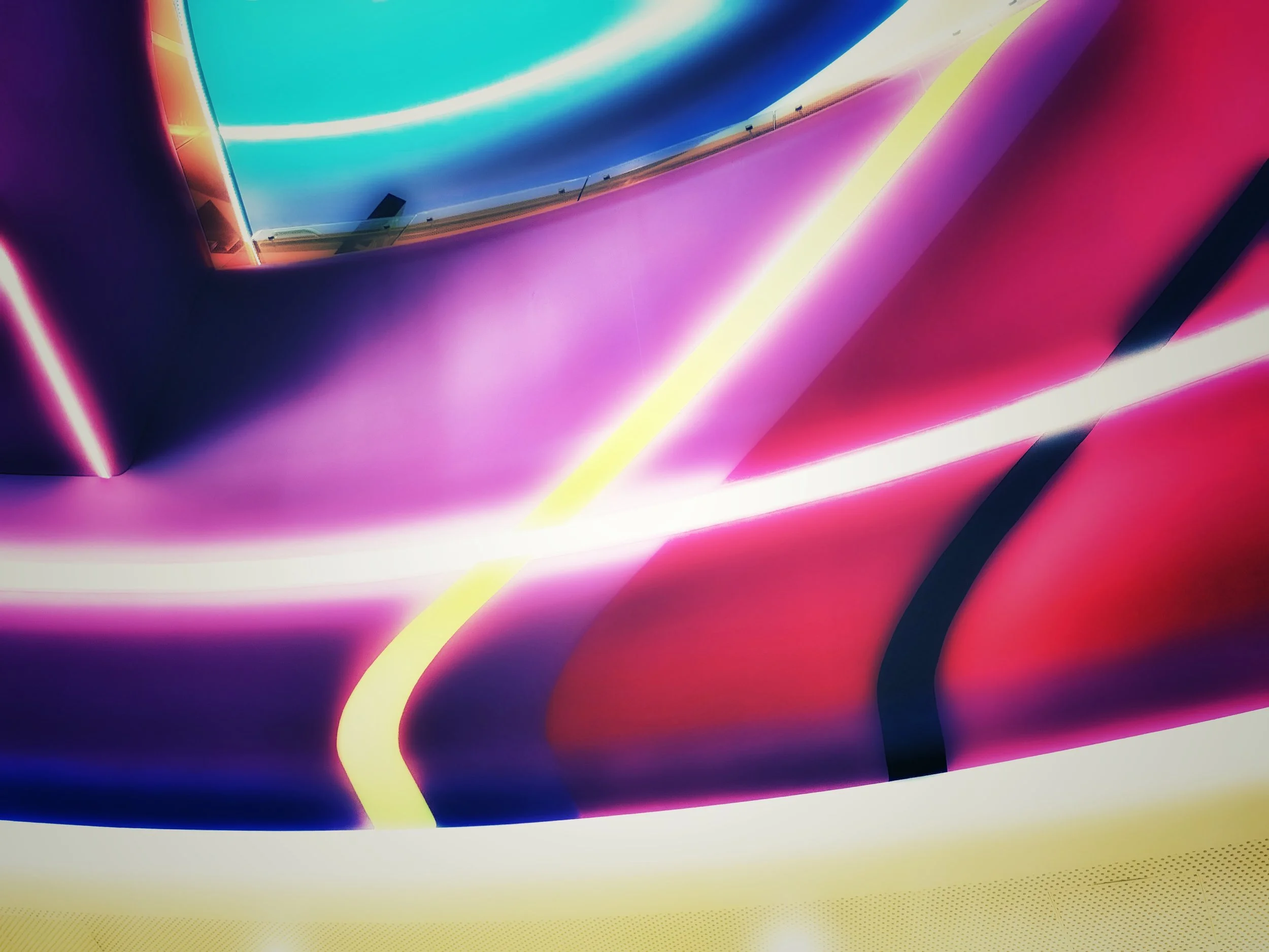
Warm tones pull the viewer inward, creating intimacy and a sense of human presence. Cool tones push them outward, invoking distance, silence, or contemplation. Neutral palettes can introduce stillness, humility, or timelessness. Saturated tones inject urgency, while desaturated ones convey memory, nostalgia, or an almost cinematic melancholy.
In contemporary photography, color has become less about representing reality and more about constructing reality. It moves the image into the territory of emotional design, a place where the photographer is no longer simply documenting, but orchestrating.
The emotional architecture of an image is not accidental. It is the result of how light interacts with tone, how hue guides attention, how shadows compress or release tension. Color becomes the silent “atmosphere builder”—the element that decides whether a scene feels overwhelming, serene, nostalgic, or enigmatic.
Beyond Aesthetics: Color as Concept
Aesthetic choices are only the surface. In contemporary practice, color has become conceptual. It is no longer just “beautiful”; it carries meaning.
A monochromatic palette, for example, can strip a scene of distractions and push the viewer toward form, gesture, or rhythm. A bold color contrast can introduce conflict. A muted landscape can reveal emotional fatigue. A vibrant urban scene can celebrate the chaos of modernity while hinting at our inability to fully digest it.
Color is not decoration—it is interpretation.
In architectural photography, cool metal tones can become metaphors for anonymity or ambition. In travel photography, warm light can transform distant places into emotional states rather than destinations. In portraiture, a deliberate palette can reveal psychological truths that the subject’s expression alone cannot carry.
Contemporary photographers increasingly use color to embed metaphors directly into the image. It becomes a carrier of themes such as isolation, exuberance, memory, identity, or dissonance. And in doing so, it shifts the photograph from representation to conversation.
The Psychology of Color: A Dialogue with the Viewer
The emotional power of color is rooted in psychology. Our brains process color faster than they process shape. We feel color before we understand it.
This is why:
Red triggers alertness, desire, or urgency.
Blue calms, distances, or intellectualizes.
Yellow awakens attention and evokes warmth or fragility.
Green evokes balance, natural rhythm, or renewal.
Orange and teal, a modern cinematic pairing, create tension between warmth (life) and coolness (distance).
Black and white remove color entirely—but in doing so, amplify structure, silence, and emotional clarity.
These reactions are not fixed, but intertwined with cultural memory, personal experience, and visual literacy. What matters is that color becomes a dialogue: the photographer speaks, the viewer responds—sometimes consciously, often without realizing it.
Color and Memory: How Images Linger
Every photographer knows that some images stay with the viewer long after they’re seen. Color is one of the reasons why.
A vivid palette can brand an image into memory with immediacy, like a neon sign. A soft, dusty palette might enter more quietly but linger longer, like a scent. A monochrome palette can transform a contemporary moment into something that feels mythic or timeless.
Color shapes not only how we perceive the moment, but how we remember it. A city photographed in cold blue tones becomes a place of solitude. The same city photographed in warm amber becomes nostalgic. Nothing has changed except the emotional key.
This emotional manipulation is not deceitful—on the contrary, it is intentional. It reveals that photography is never objective. It is always an act of emotional construction.
Color Grading as a Narrative Tool
In the digital era, color grading has expanded the palette of possibilities. Editing is no longer a correction—it is an authorship gesture.
Contemporary photographers are increasingly defined by their chromatic signature: a distinct palette that carries their emotional world across projects and subjects. Whether subtle or bold, this signature becomes a form of narrative consistency.
Color grading can:
unify a series,
create mood,
sculpt atmosphere,
guide storytelling,
and articulate the photographer’s voice.
Color grading is not cheating; it is writing. It is the final paragraph of the story the image wants to tell.
The Future of Color in Photography
Looking ahead, color will continue to evolve from decorative attribute to intellectual structure. As AI expands visual culture and images multiply without pause, color becomes a way for photographers to reclaim intentionality.
In a landscape of algorithm-generated visuals, human-created color choices stand out precisely because they are emotional, imperfect, and deeply personal.
Color is not simply what we see—it is what we feel.
In contemporary photography, color is not the finishing touch.
It is the architecture of emotion itself.
If this visual language speaks to your space, you can explore more works.