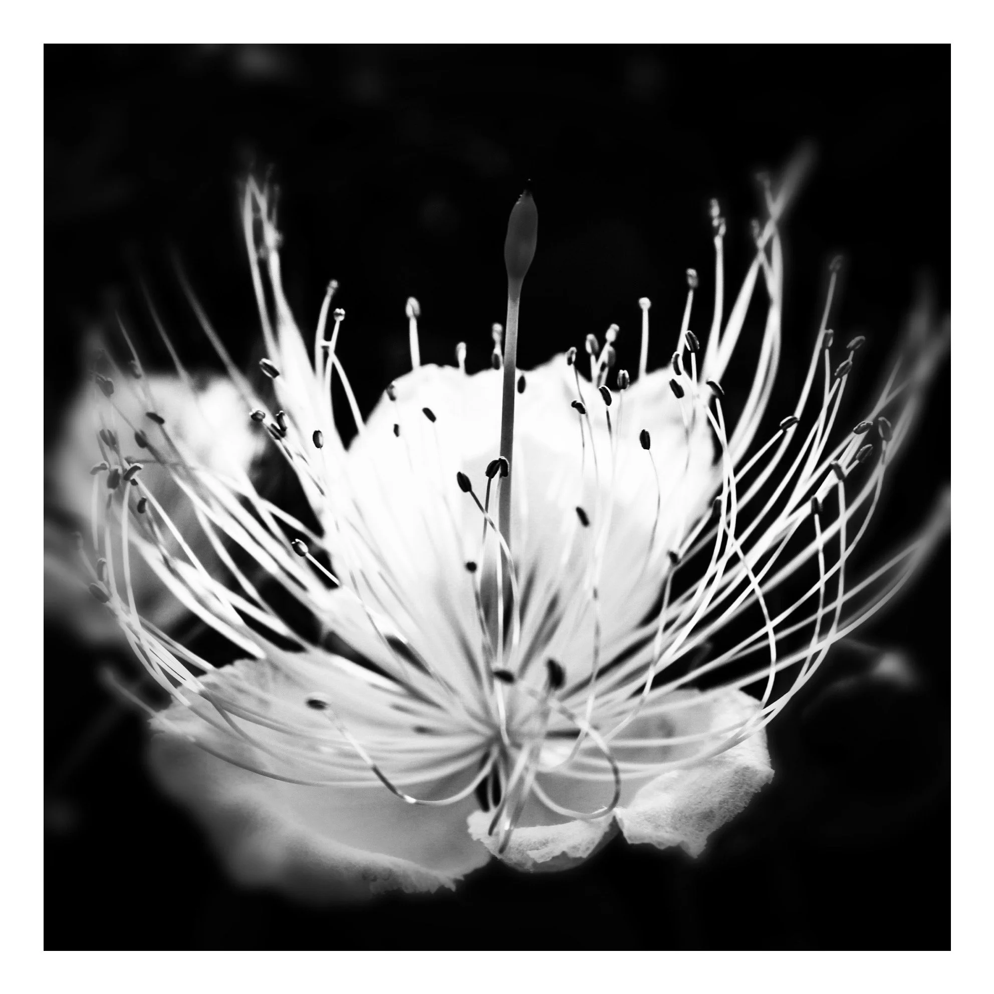
Black and White Photography: A Language, Not a Shortcut
Black and white photography has always carried a particular weight. It feels serious, timeless, cultured. It evokes history, authorship, intention. Perhaps for this reason, it is often perceived as a shortcut to depth: remove color, add gravitas. And yet, this perception is both true and dangerously misleading.
Used with awareness, black and white is one of the most powerful visual languages available to photography. Used without it, it risks becoming a cosmetic gesture — a way to elevate images that struggle to stand on their own in color. The question, then, is not whether black and white is “better” than color, but why we choose it. And what kind of black and white we are actually using.
At its best, black and white is not subtraction but transformation. It does not merely remove color; it reorganizes vision. It asks the photographer to think in terms of light rather than hue, structure rather than surface, rhythm rather than decoration. When color disappears, relationships become visible: between forms, between tones, between presences in space. There is no chromatic distraction to rely on. Everything must hold together through composition, contrast, and intention.
This is why black and white demands more, not less. It is unforgiving. Weak light becomes flat. Poor composition becomes obvious. Hesitant framing loses its alibi. When the image works, it does so because the photographer has embraced the discipline of seeing differently, not because something has been hidden.
And yet, in contemporary practice, black and white is often used precisely as a hiding place. Many images are converted to monochrome not because the photographer saw the scene in black and white, but because color exposed its limitations. Unbalanced palettes, unpleasant hues, visual noise — all softened by the elegance of grayscale. In these cases, black and white becomes a form of visual makeup: tasteful, flattering, but ultimately superficial.
This is not a moral failure, but it is an aesthetic one. The problem is not experimentation, but confusion between language and effect. A true black and white photograph is conceived as such from the beginning. It is not a rescue operation performed in post-production. It is a way of seeing before it is a way of editing.
Historically, black and white was not a choice but a condition. Early photographers worked within technical constraints, yet produced images of extraordinary depth and complexity. What we admire in their work is not the absence of color, but the mastery of light. Shadows were not mistakes to be corrected but elements to be shaped. Highlights were not accidents but decisions. The image was built through tonal architecture, not chromatic seduction.
When color photography became dominant, black and white did not disappear. Instead, it transformed from necessity into statement. Choosing black and white became a declaration: this image is not about realism, but about interpretation. It is not about how things look, but how they mean.
In this sense, black and white is profoundly dialectical. It creates tension between presence and absence, between what is shown and what is withheld. Color tells us what something is; black and white asks us to consider why it is there at all. It slows the gaze. It resists consumption. It invites contemplation rather than recognition.
This is why many photographers turn to black and white during moments of introspection or transition. It can function as a refuge — a quieter space, a reduction of stimuli, a way to regain control over vision. There is nothing wrong with this. But refuge should not become avoidance. When black and white is used to escape complexity rather than confront it, its power dissolves.
A meaningful black and white image does not feel “artistic” by default. It feels necessary. Color would not add information; it would dilute it. The photograph exists in monochrome because that is the only form in which it makes sense. Anything else would be excess.
This is the difference between style and language. Style is repeatable, comforting, often marketable. Language is demanding, specific, and sometimes uncomfortable. Style asks to be liked; language asks to be understood.
In today’s visual culture, where images are produced and consumed at an overwhelming speed, black and white often benefits from an aura of seriousness. It slows the viewer down, or at least signals that slowing down is expected. This makes it appealing as a branding tool, a way to position work as “artistic” or “thoughtful.” But when this aura is not supported by substance, it collapses quickly.
The most compelling black and white photographs are those in which the photographer has accepted the risk of exposure. Nothing is hidden. The image either holds, or it doesn’t. Light is not decoration; it is structure. Contrast is not drama; it is meaning. Absence is not emptiness; it is intention.
So the real question is not whether black and white is a powerful choice. It unquestionably is. The question is: how is it being used? As a refuge or as a dialogue? As a filter or as a language? As an aesthetic mask or as a form of thought?
Every photographer who works in black and white eventually reveals their position through their images. Some seek elegance, others silence, others control. Some seek depth, others safety. None of these motivations are inherently wrong. But they are not equivalent.
Black and white photography does not make an image profound. It exposes whether depth was there to begin with.
And so the question remains, open and necessary:
what kind of black and white do you use?
If this visual language speaks to your space, you can explore more works.
